Skip to content
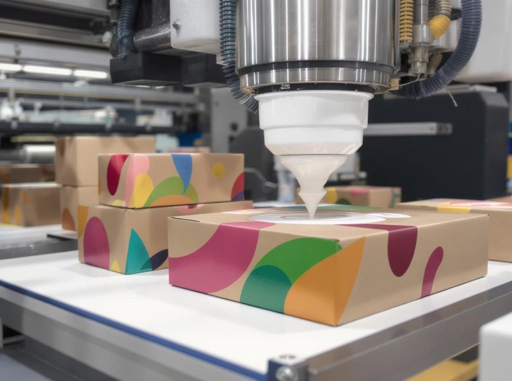
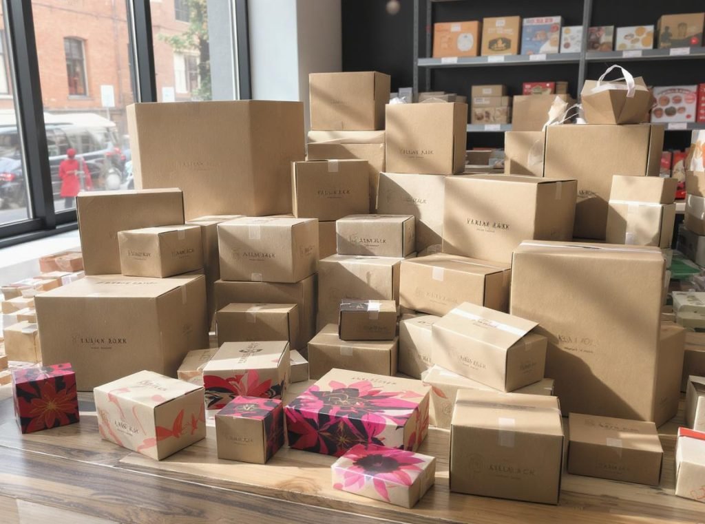
You’re considering kraft boxes for your product packaging, but you’re worried about whether your brand colors will look dull and washed out on that natural brown surface. Many businesses face this exact dilemma when choosing between sustainability and vibrant branding.
Yes, you can achieve vibrant print colors on brown kraft boxes using specialized printing techniques like white ink undercoating, offset printing methods, and strategic color selection. While kraft’s natural brown tone and absorbent surface present challenges, modern printing technologies can produce stunning, eye-catching designs that maintain both sustainability and visual impact.
Let’s explore exactly how you can make your brand colors pop on kraft packaging and why this might be the perfect solution for your business.
What Makes Printing on Brown Kraft Boxes Challenging?
Understanding the unique properties of kraft paper helps explain why achieving vibrant colors requires special technical considerations and advanced printing methods.
Brown kraft paper’s natural absorbency, surface texture, and color interference create multiple obstacles for vibrant color reproduction. The paper’s porous, fibrous surface causes inks to soak in rather than sit on top, while the brown undertone shifts printed colors and reduces contrast, particularly affecting lighter hues.
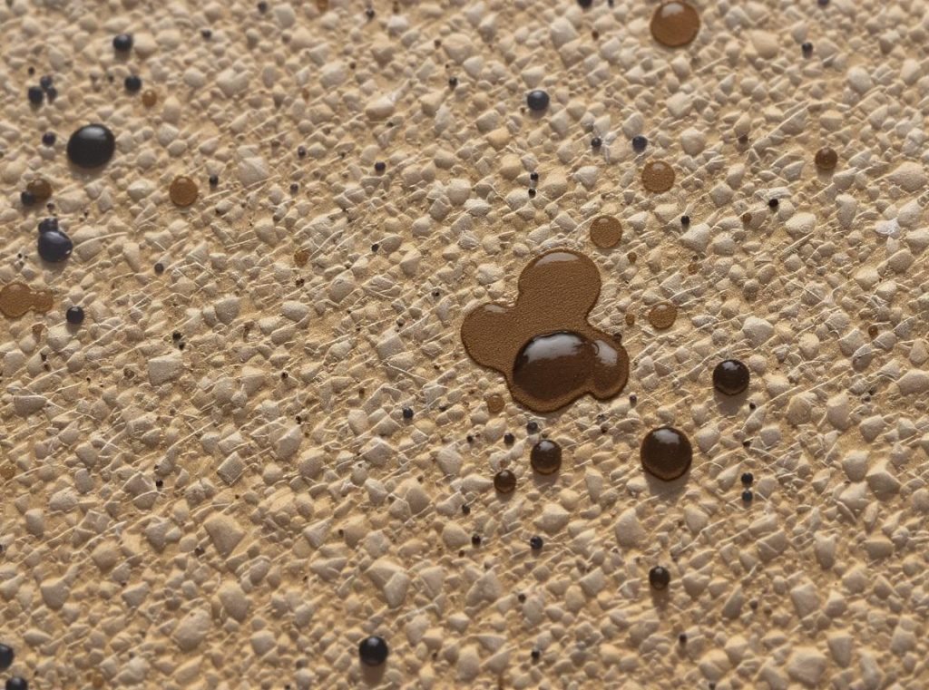
The primary challenge stems from kraft paper’s natural absorbency and porosity. Unlike coated white cardboard, kraft’s uncoated, fibrous surface allows ink to penetrate deeply into the paper structure. This absorption causes colors to lose saturation and intensity as they spread beyond intended boundaries, creating less defined edges and muted appearance.
Color interference presents another significant hurdle. The brown base color of kraft paper doesn’t simply provide a neutral background – it actively affects how printed colors appear. The brown undertone mixes with printed inks, causing them to appear darker, warmer, and more muted than intended. Colors in the orange, yellow, and brown spectrum become nearly invisible due to lack of contrast against the natural kraft tone.
Surface texture irregularities compound these challenges. The natural fiber texture creates an uneven printing surface that can cause mottling effects, where ink coverage appears inconsistent across the printed area. These variations make it difficult to achieve fine detail and sharp edges that would be possible on smooth, coated substrates.
Standard CMYK printing inks have inherent transparency, which allows the brown substrate to show through, particularly in lighter tones. This transparency effect amplifies the color shifting problems and makes it nearly impossible to achieve true color reproduction without specialized treatments.
Which Printing Methods Work Best for Vibrant Colors on Kraft?
Different printing technologies offer varying levels of success when dealing with kraft’s unique challenges, with some methods specifically engineered to overcome substrate limitations.
Offset printing provides the highest quality and color accuracy for kraft applications, while flexographic printing offers cost-effective solutions for large volumes. Digital printing excels for short runs and prototypes, though each method requires specific adaptations for optimal kraft performance.
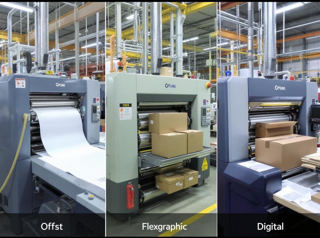
Offset Printing Excellence
Offset printing delivers superior detail reproduction and can handle complex multi-color designs with exceptional precision. This method works best when combined with white ink undercoating for vibrant colors, though it requires higher setup costs that make it most economical for medium to large production runs.
The offset process allows for precise ink density control and superior registration accuracy, critical factors when printing multiple layers on kraft substrates. The method’s ability to maintain consistent ink film thickness across large sheets ensures uniform color reproduction.
Flexographic Printing Efficiency
Flexographic printing represents the most common method for kraft box printing due to its speed and cost-effectiveness for large volumes. Modern flexographic systems can achieve excellent quality results, particularly suited for simpler designs with fewer colors.
Flexographic printing works exceptionally well for bold, high-contrast designs but may struggle with fine details and gradient effects. The method’s ability to handle varying substrate thicknesses makes it ideal for kraft’s natural texture variations.
Digital Printing Flexibility
Digital printing offers ideal solutions for short runs, prototypes, and designs requiring frequent changes. This method provides quick turnaround times with no plate costs, making it economical for smaller quantities despite higher per-unit costs.
Digital systems have limitations in color vibrancy on uncoated kraft substrates without special treatments, but newer technologies are increasingly capable of handling kraft’s challenges effectively.
| Printing Method | Quality Level | Best Volume Range | Kraft Suitability | Setup Costs |
|---|---|---|---|---|
| Offset | Excellent | Medium-Large | High with treatments | High |
| Flexographic | Very Good | Large volumes | Excellent | Medium |
| Digital | Good-Excellent | Small-Medium | Good with adaptations | Low |
| Screen | Good | Small batches | Excellent for solids | Medium |
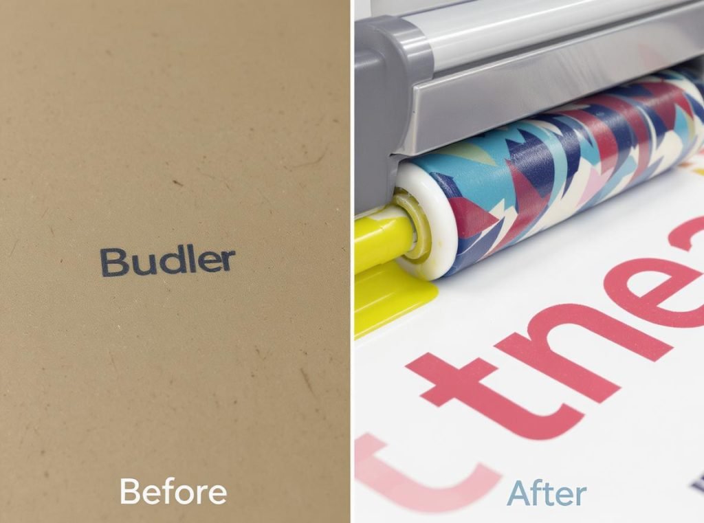
How Does White Ink Undercoating Transform Color Vibrancy?
White ink undercoating represents the most revolutionary technique for achieving true color reproduction on kraft substrates, essentially creating a white canvas on brown paper.
White ink undercoating creates an opaque foundation that blocks kraft’s brown tone from interfering with printed colors. This multi-pass technique requires specialized equipment and precise registration but allows pastels, bright colors, and brand-specific hues to display with near-identical accuracy to printing on white substrates.
Technical Process Requirements
The white ink application involves applying an opaque white base layer before printing colored inks, effectively transforming the brown kraft surface into a printable white canvas. This process demands specialized equipment capable of handling opaque white ink formulations and maintaining precise registration between multiple ink layers.
Pre-treatment preparations are crucial for success. The kraft paper undergoes specialized finishing treatments that help white ink adhere properly and prevent bleeding or show-through. These treatments ensure the opacity needed for effective color reproduction while maintaining the paper’s structural integrity.
Multiple Pass Precision
Achieving adequate white opacity typically requires multiple passes or heavy ink coverage, with some advanced printing systems offering variable white ink density options (high, medium, or low) based on specific design requirements. The white ink must reach sufficient opacity to completely block the brown substrate from affecting subsequent color layers.
Registration challenges demand sophisticated press control and monitoring systems. Any misalignment between the white underprint and color layers results in visible brown edges around design elements, compromising the final appearance.
Specialized Formulations
White ink formulations for kraft substrates differ significantly from standard CMYK inks, featuring different viscosities, opacity levels, and drying characteristics. The process requires careful calibration of ink density, drying times, and press speeds to achieve consistent results across large production runs.
This technique enables businesses to use exact brand colors, print photographic images, create gradient effects, and maintain design consistency across different packaging materials – capabilities that would be impossible with direct kraft printing.
What Colors Work Best on Brown Kraft Without Special Treatment?
When printing directly on kraft without white undercoating, strategic color selection can create striking designs that work with kraft’s natural characteristics rather than against them.
Dark, high-contrast colors like rich black, navy blue, forest green, and deep burgundy display excellently on brown kraft, creating sophisticated designs with strong readability. These colors provide natural contrast that’s both visually appealing and cost-effective, avoiding the need for white undercoating treatments.
Optimal Color Specifications
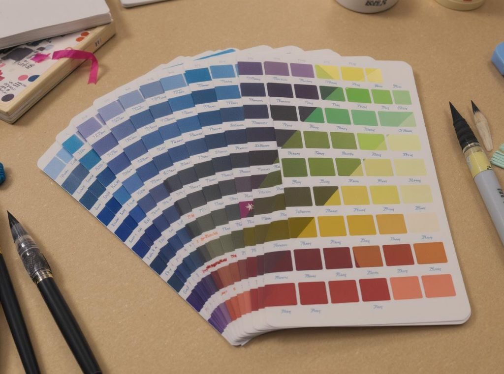
Dark, saturated colors perform exceptionally well against kraft’s brown background. Rich black formulations (CMYK: 60, 40, 40, 100) provide superior depth and contrast compared to standard black ink. Navy blue (CMYK: 63-100, 0, 0-12, 0) maintains excellent visibility while complementing kraft’s natural earth tones.
Deep reds using CMYK values of 5-15, 90-100, 75-100, 0 create vibrant appearance despite the brown substrate influence. Forest green and deep burgundy work harmoniously with kraft’s organic aesthetic while maintaining strong visual impact.
Colors to Strategically Avoid
Light colors present significant challenges on kraft substrates. Pastels, light blues, pinks, and grays lack sufficient contrast and may appear muddy or disappear entirely against the brown background.
Yellow spectrum colors (CMYK: 0-20, 0-20, 100, 0-20) become nearly invisible against kraft’s natural tone. Colors similar to kraft itself – orange, beige, and light brown tones – will blend with the substrate and lose definition entirely.
Design Strategy Applications
This natural color approach offers multiple advantages beyond cost savings. Environmental benefits increase since fewer ink layers are required, maintaining kraft’s sustainable appeal. Brand alignment works particularly well for companies emphasizing natural, organic, or eco-friendly values.
The approach enables creative use of kraft’s natural color as negative space, creating sophisticated designs that celebrate rather than hide the material’s inherent characteristics.
How Can You Design Effectively for Brown Kraft Surfaces?
Effective kraft box design requires understanding how to leverage the material’s unique properties while adapting traditional design principles to work with rather than against kraft’s characteristics.
Successful kraft design relies on high-contrast color schemes, bold typography, strategic negative space utilization, and simplified graphics that embrace kraft’s natural texture. Smart design choices can create premium-looking packaging without expensive printing treatments.
Typography Adaptation Strategies
Font selection becomes critical on kraft’s textured surface. Sans-serif fonts generally outperform serif fonts due to their cleaner lines and better definition against rough textures. Increase font sizes by 10-15% compared to white substrate applications to maintain readability.
Bold, thick fonts maintain clarity against kraft’s surface irregularities, while thin or delicate fonts may appear broken or unclear. The textured background can cause fine lines to appear fragmented or inconsistent.
Layout and Composition Principles
Create generous spacing around important design elements to prevent cluttered appearance against the textured background. Use kraft’s natural color strategically as negative space, allowing it to become an integral part of your design aesthetic rather than something to overcome.
Consider die-cut windows or partial coating applications that expose kraft in strategic areas while providing white-coated zones for colorful graphics where absolutely necessary.
Visual Hierarchy Techniques
Simple geometric shapes translate effectively onto kraft surfaces and maintain clean edges despite the paper’s texture. Minimalist logos with strong contrast perform significantly better than complex, detailed artwork.
Hand-drawn or rustic design elements naturally complement kraft’s organic appearance, creating cohesive visual themes that feel intentional rather than compromised.
| Design Element | Effectiveness Rating | Recommended Approach |
|---|---|---|
| Bold Typography | Excellent | Sans-serif, 15% larger sizing |
| Simple Graphics | Very Good | High contrast, minimal detail |
| Photographic Images | Requires Treatment | Use white base for critical images |
| Detailed Illustrations | Fair | Simplify or avoid |
| Geometric Shapes | Excellent | Clean lines, bold execution |
Are There Alternatives to Achieve Vibrant Colors on Sustainable Packaging?
Several innovative approaches allow businesses to maintain environmental responsibility while achieving excellent color reproduction, offering compromises between sustainability and visual impact.
Clay-coated kraft back (CCK), recycled white substrates, and hybrid coating techniques provide sustainable alternatives that enable vibrant printing. These solutions balance environmental credentials with marketing requirements, often at competitive costs.
Clay-Coated Kraft Back Solutions
Clay-coated kraft back (CCK) materials feature white clay-coated front surfaces optimized for high-quality printing while maintaining natural kraft backs. This construction offers sustainable kraft benefits with excellent printability for vibrant colors, representing an ideal compromise for many applications.
The white coating eliminates color shifting issues while preserving kraft’s structural advantages and environmental appeal. This material handles complex graphics, photographic images, and precise color matching requirements effectively.
Sustainable White Alternatives
Recycled white cardboard provides environmental benefits while enabling vibrant printing capabilities. Modern recycled papers achieve whiteness levels comparable to virgin materials with excellent ink adhesion and color reproduction characteristics.
These materials maintain strong sustainability credentials while solving color vibrancy challenges, often at competitive costs for high-volume applications.
Hybrid Application Techniques
Selective coating approaches combine kraft’s natural appeal with strategic white-coated areas, applying white base only where vibrant colors are essential while leaving the remainder natural kraft.
Window techniques use die-cutting to reveal printed elements on white inserts while maintaining kraft exterior appearance. Lamination options include applying printed white labels or films to specific kraft box areas where color accuracy is critical.
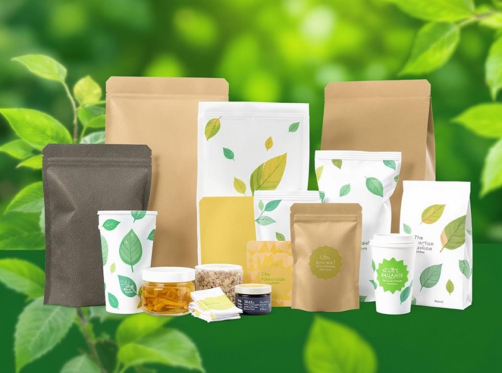
Alternative Sustainable Substrates
Emerging sustainable materials offer additional options:
- Sugarcane packaging (bagasse): Made from agricultural waste, provides good printability in natural off-white color
- Recycled cardboard: Offers smooth printing surfaces while maintaining recyclability
- Water-based and soy-based inks: Eco-friendly alternatives that produce vibrant colors while maintaining environmental sustainability
These alternatives maintain eco-friendly appeal while solving color vibrancy challenges through material innovation rather than printing technique modifications.
What Should You Consider When Choosing a Printing Partner?
Selecting the right manufacturing partner is crucial for successful kraft box printing, as the technical expertise and equipment capabilities vary significantly among suppliers.
Look for printing partners with demonstrated kraft printing experience, white ink capabilities, robust quality control systems, and technical consultation services. The right partner provides design guidance, consistent results, and cost-effective solutions tailored to your specific requirements.

Technical Capability Assessment
Verify your potential partner offers white ink printing capabilities, as not all facilities have this specialized equipment. Ask for samples of previous kraft printing work, particularly projects demonstrating white ink applications and color matching on kraft substrates.
Confirm their color matching processes for kraft substrates. Experienced printers have developed systems for predicting how colors will appear on brown backgrounds and can provide accurate color proofing.
Experience and Expertise Evaluation
Choose manufacturers with extensive kraft printing experience who understand the unique challenges and have developed solutions. Look for partners who can advise on design modifications that improve printing outcomes on kraft surfaces.
Request case studies or examples of similar projects they’ve completed, paying particular attention to how they handled color vibrancy challenges and any innovative solutions they implemented.
Quality Control and Testing Protocols
Discuss their proofing processes for kraft printing, understanding that digital proofs may not accurately represent final results on kraft substrates. Ask about physical proof options or press check procedures for critical color-matching projects.
Understand their policies regarding color variations that may occur due to kraft’s natural characteristics, and ensure they have systems in place to minimize these variations.
Technical Support and Consultation
Look for partners who provide comprehensive design guidance and technical consultation to optimize artwork for kraft printing. They should understand limitations and possibilities of different printing methods on kraft substrates.
Verify they offer testing services, including press proofs on actual kraft substrates, and are willing to run test prints to verify color matches and design effectiveness before full production.
At Acreet, we specialize in navigating kraft printing challenges with advanced white ink capabilities, experienced technical teams, and comprehensive testing protocols. Our kraft printing expertise helps you achieve vibrant colors while maintaining sustainable packaging goals. Contact us to discuss your specific requirements and see samples of our kraft printing capabilities.
How Do Printing Costs Compare Across Different Kraft Color Methods?
Understanding the cost implications of different kraft printing approaches helps businesses make informed decisions that balance visual impact, sustainability goals, and budget constraints.
Direct kraft printing costs 20-30% less than white substrate printing, while white undercoating adds 40-60% to base costs. Method selection significantly impacts pricing, with flexographic offering the best value for large volumes and digital printing optimal for short runs despite higher per-unit costs.
Method-Specific Cost Analysis
Direct kraft printing represents the most economical option when using colors that work naturally with kraft’s brown tone. Costs typically run 5-7% lower than white substrate alternatives, with no additional white ink expenses or complex registration requirements.
White ink undercoating adds substantial costs due to additional ink usage, extra press passes, and specialized equipment requirements. The cost increase can be significant but may be justified for designs requiring precise color matching or brand compliance.
Volume Impact Considerations
Setup costs remain relatively consistent regardless of quantity, making larger orders significantly more cost-effective per unit. White ink printing requires specialized equipment, which may limit supplier options and affect competitive pricing.
Digital printing offers lower minimum order quantities but higher per-unit costs compared to conventional methods. The break-even point typically occurs around 1,000-2,500 units, depending on design complexity.
Long-term Value Assessment
Consider the total cost of ownership when evaluating printing methods. Higher-quality printing may justify increased initial investment through improved brand perception, reduced reprint needs, and enhanced shelf appeal.
Factor in the durability and consistency of different printing methods. Premium printing techniques often provide more consistent results across large production runs, reducing waste and quality control issues.
| Cost Factor | Basic Kraft | Spot Colors | White + Full Color | Impact on Decision |
|---|---|---|---|---|
| Setup Costs | Low | Medium | High | Volume-dependent |
| Per-Unit Cost | Lowest | Medium | Highest | Budget-critical |
| Quality Level | Good | Very Good | Excellent | Brand-dependent |
| Minimum Order | Low | Medium | Medium-High | Flexibility needs |
Return on Investment Considerations
Premium kraft printing methods often deliver superior brand impact that justifies higher costs through increased sales, customer loyalty, and market differentiation. The investment in vibrant kraft printing can provide competitive advantages in crowded marketplaces.
Consider the cumulative effect of packaging quality on brand perception. Consumers increasingly associate packaging quality with product quality, making the investment in superior printing a strategic brand-building expense rather than simply a production cost.
Summary
Achieving vibrant print colors on brown kraft boxes is absolutely achievable with the right combination of printing techniques, color strategy, and manufacturing expertise. While kraft’s natural characteristics present unique challenges including color interference, absorbency, and surface texture variations, modern printing technologies like white ink undercoating, offset printing methods, and strategic design approaches can produce stunning results that maintain both sustainability and visual impact. Whether you choose to work with kraft’s natural aesthetic through high-contrast color schemes or invest in advanced printing techniques for full color reproduction, success depends on partnering with experienced manufacturers who understand kraft’s unique requirements and can guide your design decisions accordingly.
Ready to create eye-catching kraft packaging that delivers both environmental responsibility and brand impact? Contact Acreet today for expert consultation, comprehensive samples, and custom solutions that transform your packaging vision into reality. Our specialized kraft printing capabilities and technical expertise ensure your products stand out while maintaining the sustainable values your customers appreciate.