Skip to content
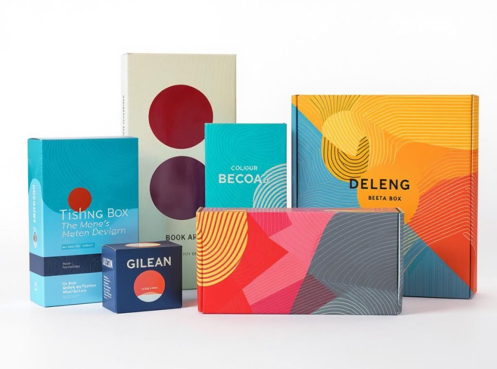
Your custom packaging serves as the first physical interaction customers have with your brand, making design elements crucial for immediate impact. Poor packaging design can cost you sales and brand recognition, while exceptional design drives customer loyalty and creates memorable unboxing experiences that customers share.
The five most important design elements for eye-catching custom boxes are strategic color psychology, readable typography hierarchy, compelling visual elements, premium materials with strategic finishes, and consistent brand integration across all formats. Research shows that color boosts brand recognition by up to 80%, while 85% of consumers base purchasing decisions on color alone, making these elements essential for competitive success.
Let’s explore each design element in detail to help you create packaging that captures attention and drives business results in today’s competitive marketplace.
What Role Does Color Psychology Play in Custom Box Design?
Color psychology significantly impacts consumer behavior and purchasing decisions, making it one of the most powerful tools in packaging design. Understanding how different colors affect emotions and perceptions can transform your packaging effectiveness.
Strategic color selection creates immediate emotional connections with customers while ensuring your packaging stands out in crowded retail environments. Research demonstrates that color boosts brand recognition by up to 80%, while 85% of consumers base their purchasing decisions on color alone, making color psychology essential for packaging success.
Understanding Color Psychology and Consumer Behavior
Different colors trigger specific emotions and associations that directly influence consumer behavior. Warm colors like red and orange create urgency and excitement, stimulating appetite and energy, making them perfect for food products and impulse purchases. Cool colors like blue and green convey trust, dependability, and calmness, which explains their popularity in tech and healthcare sectors.
Consider these proven color psychology principles for maximum impact:
- Red: Creates urgency and excitement, stimulates appetite, and is associated with energy and passion
- Blue: Conveys trust, dependability, and calmness – popular in tech and healthcare sectors
- Green: Represents nature, health, and sustainability – perfect for eco-friendly brands
- Yellow: Exudes happiness and optimism but should be used carefully as it can cause anxiety if overused
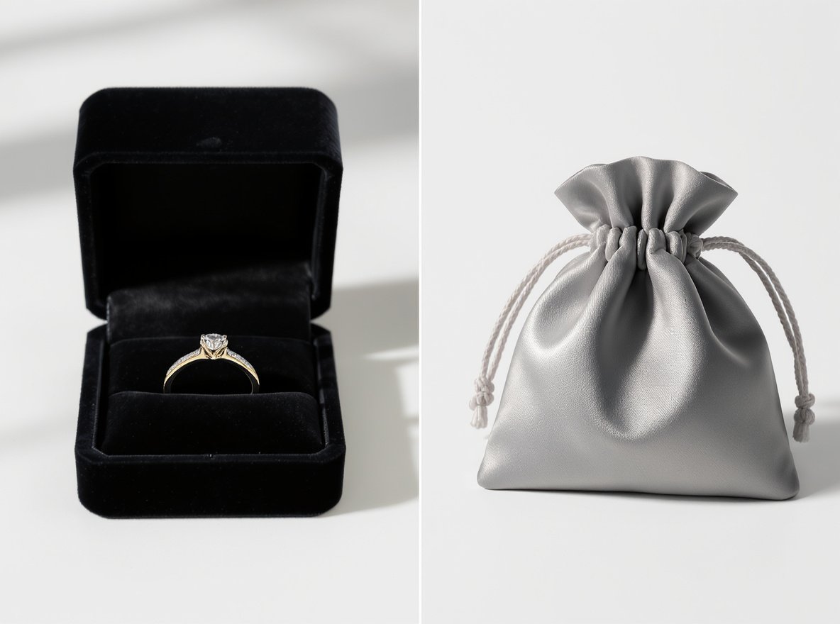
- Black: Signifies luxury, sophistication, and elegance – ideal for premium products
- Orange: Associated with creativity, enthusiasm, and youthful energy
- Purple: Combines stability and passion, associated with luxury and wisdom
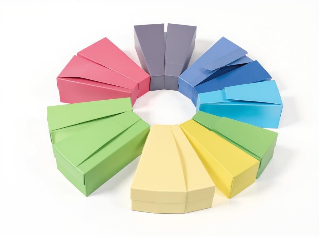
Strategic Color Application Techniques
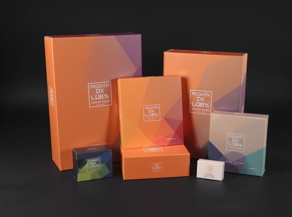
Color consistency is key to maintaining brand recognition and building trust with consumers. When customers see the same color scheme across all your products, it reinforces brand identity and creates familiarity that drives repeat purchases.
| Color Strategy | Emotional Impact | Best Applications | Consumer Response |
|---|---|---|---|
| Complementary Colors | High contrast, visual impact | Attention-grabbing displays | Increased shelf visibility |
| Analogous Colors | Harmony, sophistication | Premium products | Perceived quality boost |
| Monochromatic | Clean, modern appeal | Minimalist brands | Contemporary perception |
| Warm Tones | Excitement, energy | Food, entertainment | Impulse purchasing |
| Cool Tones | Trust, reliability | Healthcare, technology | Brand credibility |
Your color choices should align with your brand identity, target audience, and industry trends while considering cultural sensitivities for global markets. Work with experienced manufacturers who understand color matching and printing limitations to ensure consistency across production runs.
How Does Typography Hierarchy Impact Custom Box Effectiveness?
Typography serves as the primary medium for communicating product information to consumers while establishing brand personality and creating memorable experiences. Poor typography choices can render even the most beautiful packaging ineffective by compromising readability and brand communication.
Strategic typography hierarchy ensures information is readable, scalable, and understandable by diverse audiences while reinforcing brand identity. Typography must be readable from several feet away, designed to scale with three-dimensional structures, and credible in communicating product information to build consumer trust.

Establishing Information Hierarchy
Typography hierarchy divides information into three critical levels that guide consumer attention and comprehension. This systematic approach ensures customers can quickly identify key information while maintaining visual appeal.
The hierarchy of information includes:
- Primary: Brand name and product name using bold, prominent fonts that capture immediate attention
- Secondary: Detailed product information using smaller, cleaner fonts that provide essential details
- Tertiary: Additional details and legal information in minimal, unobtrusive text
Typography Styles and Brand Personality
Typography choice significantly impacts how consumers perceive your brand personality and product quality. Fun and colorful brands can use serif fonts or decorative fonts to portray cheerfulness, while serious, professional brands benefit from clean sans-serif fonts that communicate reliability and trustworthiness.
Typography-centered design is becoming increasingly popular, where text takes center stage over illustrations and photography. This approach keeps the message compact and pure, especially effective for single-product packaging where clarity is paramount.
Consider these typography strategies for different brand personalities:
- Modern, innovative brands: Geometric sans-serif fonts that convey efficiency and forward-thinking
- Traditional, established brands: Serif fonts that communicate heritage and reliability
- Luxury brands: Elegant script fonts used sparingly for sophistication
- Playful brands: Custom lettering and decorative fonts that express creativity
What Visual Elements Make Custom Boxes More Compelling?
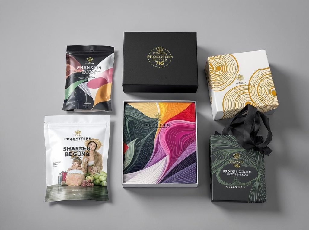
Visual elements beyond typography and color create the overall aesthetic appeal that transforms packaging into powerful marketing tools. These elements work together to tell your brand story and create memorable experiences that customers associate with quality and value.
Effective visual elements include strategic imagery, creative graphics, patterns, and interactive features that complement your brand message while maintaining professional appearance. Graphics in visual packaging design convey product information to audiences using intuitive, interesting, vivid, and rich expression that builds emotional connections.
Graphics and Imagery Strategy
High-quality product images are essential when included on packaging, as they build brand trust and loyalty by accurately depicting what customers can expect. Images should be clear, easy to see, and give consumers realistic expectations about the product inside.
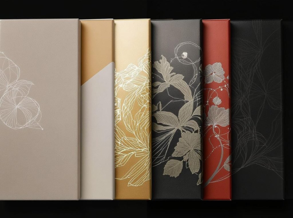
Creative graphics and illustrations can set your product apart from competitors, making it memorable and appealing to target audiences. Custom illustrations can range from detailed artwork to minimalist line drawings or quirky cartoon-like designs, depending on your specific customer demographics.
Visual elements that enhance appeal include:
- Unique shapes and structures: Experimenting beyond standard rectangular boxes to create distinctive silhouettes
- Clever cutouts: Strategic die-cut designs that reveal key parts of the product while maintaining structural integrity
- Texture and finishes: Adding tactile experiences through embossing, debossing, or specialty coatings
- Interactive elements: QR codes, NFC tags, or augmented reality features that extend brand engagement
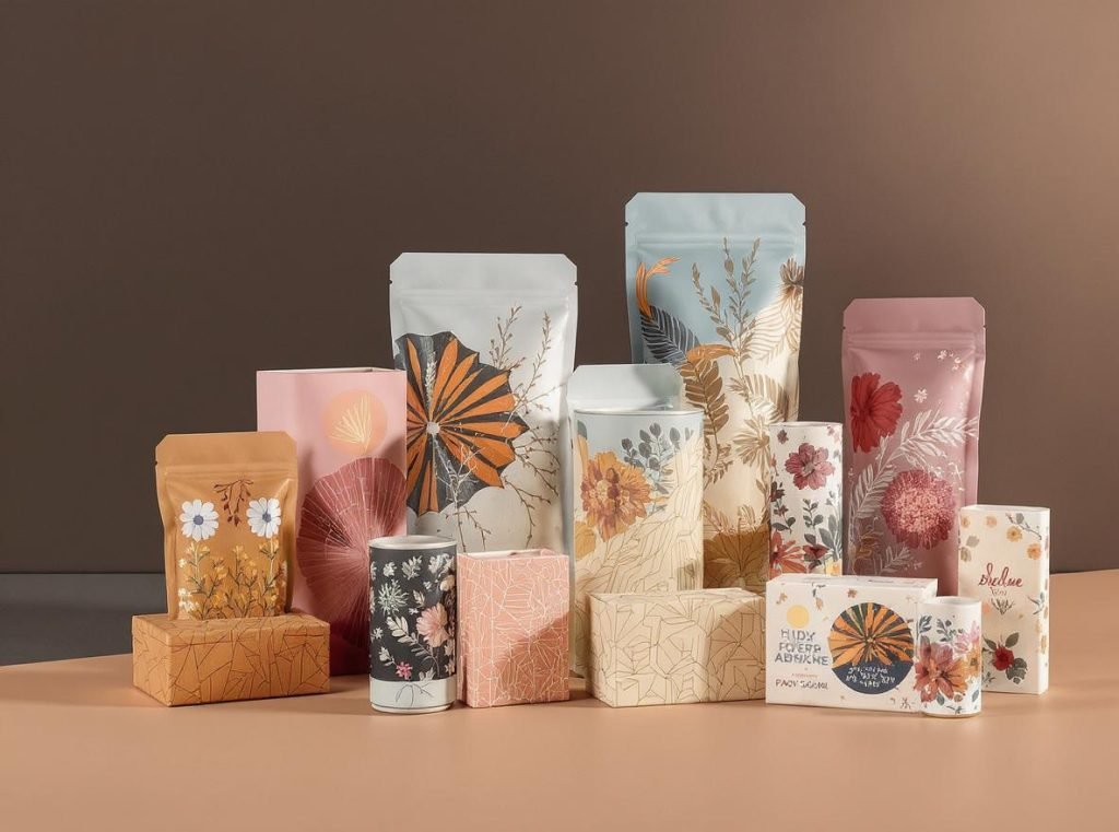
Pattern Integration and Design Motifs
Patterns add an extra layer of visual interest to box aesthetics, ranging from simple and subtle designs to intricate and bold motifs that enhance the overall theme or style. When selecting patterns, consider the box’s size and shape – large-scale patterns may overwhelm small boxes, while tiny patterns may not be visible on larger boxes.
| Visual Element Type | Primary Function | Implementation Strategy | Brand Impact |
|---|---|---|---|
| Product Photography | Showcase actual product | High-resolution, consistent lighting | Builds trust and expectations |
| Custom Illustrations | Express brand personality | Unique artwork, cohesive style | Creates memorability and differentiation |
| Patterns and Motifs | Add visual texture | Scale-appropriate, brand-consistent | Enhances aesthetic appeal |
| Interactive Features | Extend engagement | QR codes, AR integration | Increases brand interaction |
Professional packaging design requires understanding how visual elements interact with printing processes and material limitations. Work with manufacturers who can execute your vision while maintaining quality standards across different production runs.
How Do Materials and Finishes Affect Box Design Appeal?
Material selection and finishing techniques significantly impact both aesthetic appeal and perceived value of custom boxes. These choices communicate quality levels and brand positioning while ensuring products remain protected throughout the supply chain.
Strategic material choices and finishing techniques create tactile experiences that enhance brand perception and justify premium pricing. Corrugated fiberboard remains the most popular choice due to its strength, lightweight nature, and environmental friendliness, while specialty materials and finishes can dramatically elevate perceived value.
Material Selection for Brand Positioning
Different materials convey different brand messages and serve various functional purposes. Corrugated cardboard offers durability and cost-effectiveness for shipping while being 96% recyclable up to ten times. Sustainable materials are increasingly expected by consumers, making eco-friendly options essential for modern brands.
Consider these material options based on your brand positioning:
- Recycled cardboard: Cost-effective, environmentally responsible, suitable for most applications
- Kraft paper: Natural brown, white, and black variations for organic or artisanal brand appeal
- Rigid boxes: Premium feel, excellent for luxury products and gift packaging
- Specialty substrates: Metallic, holographic, and textured options for distinctive brand experiences
Printing Techniques and Strategic Finishes
Printing techniques significantly affect the final appearance and quality of custom boxes, with each method offering distinct advantages for different applications and budget requirements.
Available printing options include:
- Offset printing: High-quality image reproduction with sharp, vibrant images ideal for complex designs
- Digital printing: Perfect for short runs and customization without setup costs
- Flexographic printing: Most common for large-scale production, highly cost-effective
- UV printing: Uses special inks that dry rapidly under ultraviolet light for enhanced durability
| Finishing Technique | Visual Impact | Tactile Experience | Cost Level | Best Applications |
|---|---|---|---|---|
| Lamination (Glossy/Matte) | High protection, visual appeal | Smooth finish | Low | General protection, enhanced appearance |
| UV Coating | High-gloss finish | Slight embossed feel | Medium | Modern, tech-focused brands |
| Foil Stamping | Metallic elegance | Smooth metallic texture | High | Luxury goods, special editions |
| Embossing/Debossing | Dimensional effects | Tactile luxury | High | Premium brands, certificates |
| Soft-touch Coating | Sophisticated appearance | Velvety feel | Medium | Premium perception, luxury items |
How Can You Maintain Brand Consistency Across Different Box Sizes?
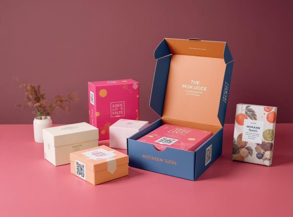
Brand consistency across various packaging formats ensures customers recognize your products regardless of package dimensions. This consistency builds brand recognition and customer loyalty while creating professional, cohesive brand experiences that foster trust.
Maintaining consistent brand elements while adapting designs for different box sizes requires establishing clear brand guidelines and scalable design systems. Standard box sizes help maintain consistent packaging aesthetics that reflect professionalism and attention to detail while simplifying decision-making and reducing errors.
Establishing Scalable Brand Guidelines
Creating a consistent brand image across different packaging formats begins with establishing a clear brand identity that includes your mission, values, tone of voice, and visual elements such as logo and color scheme. These guidelines should be comprehensive enough to maintain consistency while flexible enough to adapt to different formats.
Key elements of scalable brand guidelines include:
- Flexible logo placement: Positioning the logo in a consistent location while ensuring appropriate size and legibility across all formats
- Scalable typography: Using font families with multiple weights (light, regular, semibold, bold) to maintain hierarchy across sizes
- Adaptable color schemes: Maintaining primary and secondary brand colors while adjusting proportions for different formats
- Consistent visual style: Including brand-specific design motifs, shapes, or illustrations that work across all sizes
Avoiding Common Consistency Pitfalls
Too many exceptions to standardization guidelines often lead to disjointed brand statements at retail. When consumers encounter inconsistent designs, they lose trust in the brand and may move to competitors.
Common consistency issues include:
- Variations in scale and placement of brand identity elements
- Inconsistent treatment of product imagery across different sizes
- Changes in tone, style, and placement of marketing communication
- Use of different fonts or color variations without strategic purpose
All aspects of the package design system must be consistent for it to function properly at retail. This includes maintaining the same quality standards, visual hierarchy, and brand messaging across all packaging formats.
What Are the Latest Trends in Custom Box Design?
Staying current with design trends helps your packaging remain relevant and appealing to contemporary consumers while maintaining competitive advantage. However, trends should complement rather than override your core brand identity.
The packaging design landscape for 2024-2025 is characterized by a blend of creativity, sustainability, and deep consumer engagement. Research shows that 66% of consumers try new products because packaging caught their eye, making trend awareness crucial for competitive success and market differentiation.
2024-2025 Emerging Design Trends
Current packaging design trends emphasize several key directions that reflect changing consumer preferences and technological capabilities.
Neo-Minimalism with Bold Contrast represents a fresh evolution of minimalism that strips away excess visual elements while embracing vast negative space, clean geometric shapes, and carefully chosen details. This creates a strikingly simple yet high-impact aesthetic that commands attention in crowded retail environments.
Clever Cutouts involve strategic die-cut designs that reveal key parts of the product, offering visual hints about what’s inside. This trend combines simplicity with sophistication, using smart cutting techniques to create visual interest while maintaining structural integrity.
Sustainable Design Focus continues to dominate as environmental consciousness influences consumer purchasing decisions. This includes biodegradable materials, minimal ink usage, and designs that reduce waste while communicating environmental responsibility.
Technology Integration and Interactive Elements
Smart packaging solutions are revolutionizing the industry by incorporating technology to create multi-sensory experiences that extend beyond traditional static design.
Technology integration includes:
- QR codes and NFC tags: Providing interactive experiences that connect physical packaging to digital content
- Augmented reality integration: Creating immersive brand experiences through smartphone apps
- AI-driven personalization: Enabling hyper-customized designs based on consumer data and preferences
Interactive packaging goes beyond traditional approaches by incorporating technology to create comprehensive product information access and enhanced customer engagement opportunities.
Aesthetic Movement Trends
Vibrant Maximalism moves away from muted tones toward bold, saturated colors and dynamic patterns. This trend embraces energy and excitement while maintaining functionality and readability.
Retro-Futurism combines nostalgic design elements with modern technology and materials, creating familiar yet forward-thinking packaging that appeals to multiple generations simultaneously.
| Trend Category | Key Characteristics | Consumer Appeal | Implementation Strategy |
|---|---|---|---|
| Neo-Minimalism | Clean lines, bold contrast | Sophisticated, modern | Strategic use of negative space |
| Sustainable Design | Eco-friendly materials | Environmental consciousness | Biodegradable options, minimal waste |
| Interactive Elements | Technology integration | Engagement, discovery | QR codes, AR features |
| Vibrant Maximalism | Bold colors, dynamic patterns | Energy, excitement | Saturated color palettes |
| Retro-Futurism | Nostalgic meets modern | Multi-generational appeal | Vintage elements with modern execution |
Summary
Creating eye-catching custom boxes requires mastering five essential design elements: strategic color psychology that leverages the fact that 85% of consumers base purchasing decisions on color, readable typography hierarchy that communicates effectively across diverse audiences, compelling visual elements that create memorable brand experiences, premium materials with strategic finishes that enhance perceived value, and consistent brand integration that builds recognition across all packaging formats. When these elements work harmoniously with current trends like sustainability and interactive technology, they create packaging that not only captures attention but also drives customer loyalty and business growth.
Ready to transform your packaging into a powerful marketing tool that leverages these proven design principles? Contact Acreet today for expert custom box design and manufacturing services that incorporate the latest trends and psychological insights. Our experienced team understands how to implement these design elements effectively while ensuring quality production, competitive pricing, and sustainable practices. Send us your inquiry to discuss how we can create packaging that makes your brand stand out and drives measurable business results in today’s competitive marketplace.