Choosing the right color printing system for your packaging can make or break your brand’s visual impact. Whether you’re launching a new product or redesigning existing packaging, understanding the fundamental differences between these two printing methods is crucial for achieving the exact look you envision.
The main difference between CMYK and Pantone (PMS) printing lies in their approach: CMYK uses four process inks (cyan, magenta, yellow, black) that overlap in tiny halftone dots to create thousands of colors, while Pantone uses pre-mixed spot inks with exact formulations that deliver identical brand colors worldwide. For most packaging projects, the decision comes down to cost versus color fidelity – CMYK handles photographs and complex designs cost-effectively, while Pantone locks in precise brand colors and special effects.
Let’s dive deeper into these two printing systems to help you make the best choice for your packaging needs.
What Exactly is CMYK Printing?
Understanding CMYK printing is essential for anyone involved in packaging design and production decisions.
CMYK stands for Cyan, Magenta, Yellow, and Key (black) – a subtractive color model where tiny halftone dots of these four inks overlap to simulate thousands of tones on press or digital equipment. This process printing method creates colors by layering transparent inks, with each color building upon the previous layer to achieve the desired shade.

The system works by using halftone dots that vary in size and spacing. When viewed from a normal distance, these dots blend optically to create the perception of continuous color. However, CMYK has specific limitations that affect packaging choices.
| Aspect | Details |
|---|---|
| Color Range | Wide spectrum but cannot reach the most saturated fluorescents, metallics, or certain deep oranges and greens |
| Consistency | Acceptable for most work but small shifts occur between presses, papers and runs; total density limited to about 300% ink coverage |
| Best Applications | Photographic images, complex gradients, short-run digital jobs, pieces using three or more colors |
| Cost Structure | One setup covers full color; pricing based on run length and coverage, not number of hues |
CMYK excels in several packaging scenarios. Digital CMYK needs no plates, keeping prototypes cheap and turnaround times fast. The system handles variable data printing seamlessly, making it ideal for personalized packaging or QR code integration that must stay in-line with the printing process.
However, CMYK colors can drift 5-10% in tone between jobs or devices, which may impact brand consistency across different packaging suppliers or production runs.
What is Pantone (PMS) Printing?
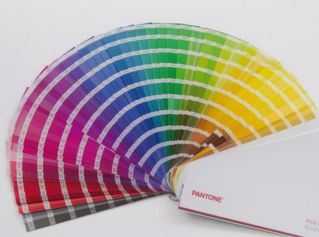
Pantone printing represents the gold standard for color accuracy and brand consistency in packaging.
The Pantone Matching System supplies pre-mixed “spot” inks identified by specific code numbers (like PMS 186 C), with every ink formulated from 13-15 base colors to ensure the same red matches worldwide. This standardized approach eliminates color variation between different printers, locations, and production runs.
Unlike CMYK’s dot-based approach, Pantone lays down solid ink films that produce sharper edges and more vibrant colors. The system offers access to colors completely outside the CMYK spectrum.
| Aspect | Details |
|---|---|
| Color Range | Over 1,800 solid colors, plus metallic, pastel and neon series unreachable in plain CMYK |
| Consistency | Very high; ink laid down as solid film keeps brand hue identical across presses and substrates |
| Specialty Effects | Metallic gold/silver, day-glo fluorescents, opaque whites on transparent films |
| Cost Structure | Each extra spot ink requires another plate or ink slot, increasing costs with every added color |
Pantone’s strength lies in its ability to maintain exact color matches across different materials, printing methods, and global production facilities. This makes it invaluable for established brands with strict color guidelines that must remain consistent whether packaging is printed in China, Germany, or Brazil.
The system also enables special effects impossible with CMYK, including true metallic finishes, fluorescent colors that glow under UV light, and opaque whites that show clearly on dark or transparent substrates.
How Do CMYK and Pantone Colors Differ in Quality?
The quality differences between these systems can significantly impact your packaging’s final appearance and brand perception.
CMYK offers excellent quality for photographic reproduction and complex designs, while Pantone delivers superior color accuracy, uniformity, and access to colors outside the CMYK gamut. Understanding these quality differences helps you choose the right system for specific packaging elements.

Key quality distinctions include:
Color Gamut and Vibrancy:
Pantone spans deeper reds, cleaner oranges, intense violets and true metallics completely unattainable in CMYK. The pre-mixed inks produce more saturated, vibrant colors because they’re not limited by the halftone dot structure.
Consistency and Uniformity:
Pantone delivers the exact same swatch every time, while CMYK can vary 5-10% in tone between jobs or devices. This variation occurs due to factors like ink density changes, press calibration differences, and environmental conditions during printing.
Edge Sharpness and Detail:
CMYK dots can show rosette patterns under magnification, while Pantone lays a flat, saturated film that appears crisper on solid areas. This makes Pantone particularly effective for clean logo reproduction and bold typography.
Modern extended-gamut hybrid systems add orange, green, and violet to traditional CMYK, achieving roughly 90% of Pantone shades without spot inks. However, these seven-color presses aren’t yet universal, and the technology comes with higher equipment costs.
Which Printing Method Costs More?
Cost considerations often determine the final printing method choice, but the calculation involves more than just ink prices.
CMYK printing is generally more cost-effective for multi-colored designs and digital runs, while Pantone costs more due to custom ink mixing, additional plates, and setup complexity. However, the cost equation changes based on run length, color count, and specific project requirements.

Cost breakdown by scenario:
Small Runs (Digital or Short-Run Offset):
CMYK almost always wins because four process inks print in one pass. Adding even one Pantone plate quickly outweighs any savings, with setup charges typically ranging $25-45 per additional PMS color.
Large Runs with Limited Colors:
A single Pantone plus black can actually beat CMYK on very high volumes because ink film is thinner and make-ready waste is lower. The break-even point varies by printer and run length.
Multiple Spot Colors:
Each additional Pantone color requires separate plates, cleaning between colors, and potentially multiple press runs. Costs escalate quickly when designs require 3+ spot colors.
| Cost Factor | CMYK Impact | Pantone Impact |
|---|---|---|
| Setup Time | Minimal – standard four-color setup | Longer – custom ink mixing and plate changes |
| Ink Costs | Standard process inks | Premium pre-mixed formulations |
| Press Efficiency | Multiple jobs can run together | Dedicated runs for color accuracy |
| Waste/Makeready | Lower due to standardization | Higher due to color matching requirements |
Consider the total cost of ownership, including potential reprints if CMYK color variation becomes problematic for brand consistency.
When Should You Choose CMYK for Your Packaging?
CMYK makes strategic sense when its strengths align with your packaging design and business requirements.
Choose CMYK when your packaging features photographic images, complex multi-colored graphics, requires variable data printing, or when budget and turnaround speed are primary concerns. The system excels in specific packaging applications where color flexibility outweighs precision.
Ideal CMYK applications include:
Photographic Content:
Product photography, lifestyle images, and complex illustrations with multiple colors and gradients. CMYK’s ability to blend colors smoothly makes it superior for realistic image reproduction.
Digital and Short-Run Projects:
Prototypes, test markets, and small batch productions benefit from CMYK’s no-plate setup. Digital presses can output CMYK immediately without the lead time required for spot color preparation.
Variable Data Requirements:
Personalized packaging, sequential numbering, or QR codes that change per unit work seamlessly with CMYK systems since all elements can print in a single pass.
Budget-Conscious Projects:
When slight color variation is acceptable and cost control is critical, CMYK provides excellent value for complex designs that would require multiple expensive spot colors.
However, be aware that CMYK may dull or disappear entirely when printing on kraft, colored, or dark substrates without white underprinting, which adds complexity and cost.
When Should You Choose Pantone for Your Packaging?
Pantone becomes essential when brand consistency and specific color requirements are non-negotiable.
Choose Pantone when your packaging requires exact brand color matching, features corporate logos with strict color standards, needs special effects like metallics or fluorescents, or prints on challenging substrates. Investment in Pantone pays off when color accuracy directly impacts brand recognition and perceived quality.

Critical Pantone applications include:
Brand Identity Protection:
Corporate logos, brand colors, and design elements that must match exactly across all packaging, marketing materials, and touchpoints worldwide. Companies like Coca-Cola and Tiffany & Co. rely on specific Pantone colors for instant brand recognition.
Limited Color Designs:
Two-or-fewer flat colors where per-plate costs remain reasonable, especially on high-volume runs. Simple designs with bold brand colors often cost less in Pantone than CMYK.
Special Effect Requirements:
Metallic finishes, fluorescent colors, day-glo effects, or opaque whites on clear films that are impossible to achieve with process printing. These specialty inks create premium packaging appearance that justifies higher costs.
Challenging Substrates:
Dark packaging materials, kraft papers, or transparent films where CMYK colors would appear muted or invisible. Pantone inks can be formulated with higher opacity and stronger pigment loads for difficult printing surfaces.
The investment in Pantone printing protects brand equity and ensures consistent customer experience across global markets and diverse packaging suppliers.
Can You Combine CMYK and Pantone in One Design?
Strategic combination of both printing methods often delivers optimal results for complex packaging projects.
Yes, you can combine CMYK and Pantone in a single design using 5- or 6-color press capabilities, typically using CMYK for photographic elements while reserving Pantone for brand-critical colors like logos. This hybrid approach leverages each system’s strengths while managing costs effectively.
Common combination strategies include:
Photography Plus Branding:
CMYK handles product images, lifestyle photography, or complex graphics while Pantone ensures brand logos, company colors, and key design elements maintain perfect consistency.
Selective Spot Color Enhancement:
Adding one or two Pantone colors to a CMYK base for premium accent effects, metallic highlights, or corporate color enforcement without fully converting to spot color printing.
Substrate-Specific Solutions:
Using Pantone for elements that must show on dark or colored packaging areas while keeping CMYK for standard white background printing areas.
Design software like Adobe Illustrator’s Recolor Artwork panel facilitates this approach by converting chosen elements to spot colors while leaving photographs in process colors. However, combination printing requires careful planning:
• More complex color management and file preparation
• Longer press setup times and higher costs than single-method printing
• Need for experienced packaging suppliers who understand hybrid workflows
• Careful proofing to ensure both color systems work harmoniously
When planned correctly, combination printing provides rich imagery with rock-solid brand color consistency.
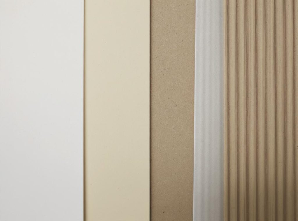
How Does Paper Type Affect CMYK vs Pantone Results?
Substrate choice dramatically influences how both printing systems perform on your final packaging.
Different paper types and coatings significantly alter color appearance, with Pantone generally maintaining better consistency across various substrates compared to CMYK due to its solid ink film structure. Understanding substrate interactions prevents costly surprises and ensures optimal color results.
Critical substrate considerations:
Coated vs Uncoated Papers:
Pantone issues separate color codes (like 186 C for coated, 186 U for uncoated) because coated papers keep ink on the surface for brighter, glossier colors, while uncoated stocks absorb ink and create more muted tones.
Absorbency and Texture:
Uncoated kraft or corrugated liners draw CMYK inks deeper into the paper fibers, lowering contrast and dulling colors. Pantone spot inks can be mixed more heavily or double-hit for better coverage on absorbent substrates.
White Point Variations:
Blue-white SBS boards make colors appear cooler than the same inks on natural kraft papers. This shift affects both systems but impacts CMYK color balance more significantly due to its layered ink structure.
| Substrate Type | CMYK Performance | Pantone Performance |
|---|---|---|
| Coated Papers | Excellent – bright, sharp colors | Excellent – maintains color integrity |
| Uncoated Papers | Good – colors appear softer | Good – better opacity than CMYK |
| Kraft/Natural | May require white underprint | Maintains color strength better |
| Dark Substrates | Poor without white base | Excellent with proper formulation |
| Transparent Films | Limited effectiveness | Ideal for opaque color coverage |
Always request wet draw-downs or press proofs on actual packaging materials rather than relying on desktop proofs or different paper stocks for critical color approval.
What About Color Management and Proofing?
Proper color management ensures your packaging colors match expectations throughout the production process.
Effective color management requires different approaches for CMYK and Pantone printing, with Pantone offering more straightforward color communication through standardized color books, while CMYK needs careful profile management and calibration. Professional color management prevents costly reprints and maintains brand consistency.
Essential color management practices:
For CMYK Projects:
Use ICC color profiles specific to your press and paper combination (like GRACoL or ISOCoated v2). Supply artwork in the correct press profile and understand that monitor colors won’t match printed results due to RGB versus CMYK color space differences.
For Pantone Projects:
Reference current physical Pantone color books rather than digital representations, as screen colors can’t accurately display spot ink appearances. Specify Pantone numbers clearly in all communications and verify color books are current since colors fade over time.
Proofing Best Practices:
Hard proofs using calibrated systems provide the most accurate color preview. Digital presses can proof Pantones within ΔE ≤ 3 for most mid-tones, while press checks at G7 or Pantone-certified facilities provide measurement targets for both CMYK densities and spot-ink Lab values.
Hybrid Project Management:
Pantone Bridge guides show the closest CMYK simulation of every spot color, essential when converting PMS colors to four-color process. Converting Pantone to CMYK with correct profiles reduces surprises and maintains acceptable color relationships.
Working with experienced packaging suppliers ensures proper color management from initial design consultation through final production, preventing costly delays and reprints.
Quick Decision Matrix for Your Packaging Project
Use this practical guide to choose the right printing method for your specific packaging needs.
This decision matrix helps you quickly evaluate whether CMYK, Pantone, or combination printing best serves your packaging project based on key factors like design complexity, brand requirements, and budget constraints.

| Question | Choose CMYK | Choose Pantone |
|---|---|---|
| Photographs or gradients present? | ✓ Ideal for complex imagery | Better handled by CMYK |
| Exact brand color required? | Acceptable approximation | ✓ Perfect match guaranteed |
| Metallic/fluorescent effects needed? | Not possible | ✓ Specialty inks available |
| Fewer than 2 colors on high volume? | Possible cost savings | ✓ Often more economical |
| Tight budget, short lead time? | ✓ Faster, more economical | Higher cost, longer setup |
| Printing on kraft/colored stock? | May need white underprint | ✓ Better opacity and coverage |
| Variable data or personalization? | ✓ Seamless integration | Complex, expensive setup |
Additional Considerations:
For packaging requiring both photographic elements and strict brand colors, consider hybrid CMYK + Pantone printing. This combination provides rich imagery with perfect logo color matching, though at higher cost than single-method printing.
Budget-conscious projects with flexibility in brand color matching should choose CMYK, especially for short runs or prototype development. However, factor in potential reprint costs if color consistency becomes problematic.
Premium packaging targeting luxury markets often justifies Pantone costs through improved color vibrancy, special effects capabilities, and consistent brand presentation across global markets.
Summary
Understanding the differences between CMYK and Pantone printing empowers you to make informed decisions for your packaging projects. CMYK excels at reproducing photographic images and complex multi-colored designs cost-effectively, while Pantone delivers unmatched color accuracy and consistency for brand-critical elements. The choice often comes down to cost versus color fidelity, with many successful packaging projects using strategic combinations of both systems.
Ready to bring your packaging vision to life with the perfect printing solution? Our experienced team at Acreet understands the nuances of both CMYK and Pantone printing for packaging applications. We can help you navigate the color decision process based on your specific brand requirements, budget, and production volumes. Contact us today to discuss your custom packaging needs and receive expert guidance on the optimal printing approach for your project.